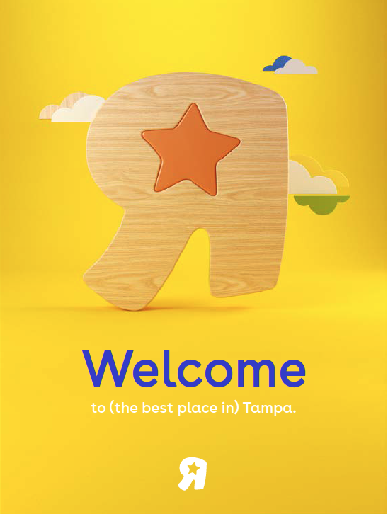
Joys“R”Us
At the heart of both Babies“R”Us and Toys“R”Us was so much joy. Parents awaiting the birth of a child could be celebrating a 5-year-old’s birthday, too. The needs were very different, and that led to very different brand expressions and a generic approach to cobranding. To create a seamless brand experience we developed a unifying “R”Us identity, bringing warmth and cheer to every conversation. This work inspired a new customer-centered culture and new cobranded strategies with successes we didn’t expect, like Breaking the internet.
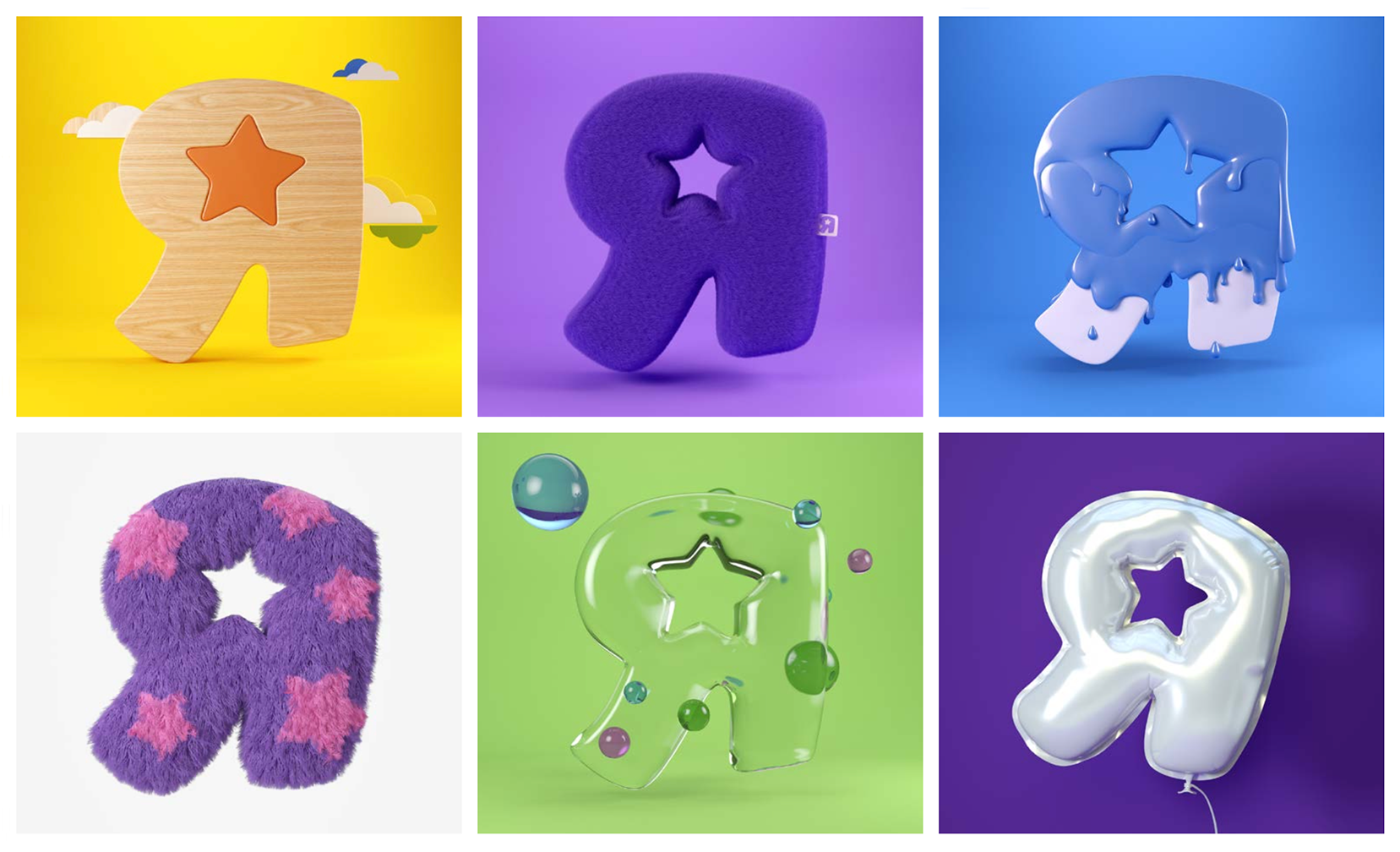
“R” icons were developed for a fun take on product categories from teethers and bath toys for babies, to party balloons and wood blocks for kids.


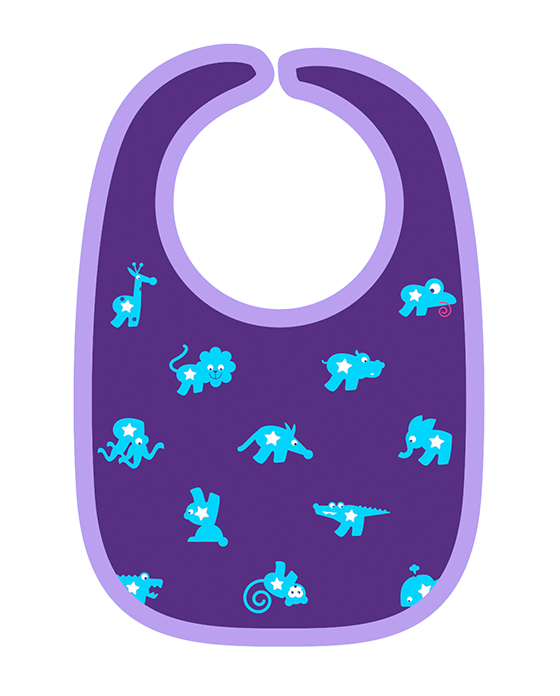

“R” characters were created for branded applications like shopping bags, gift card key fobs, balloons and branded product patterns.
Video animations added charm to the website, digital marketing and social content.
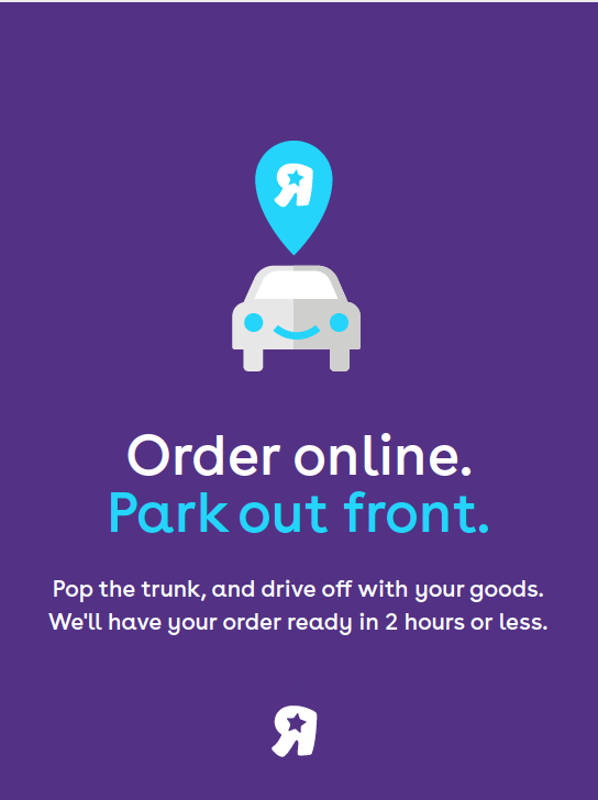
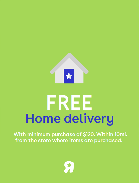
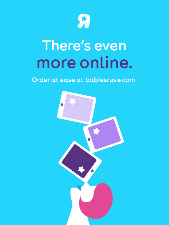
The design system’s color, illustrated icons and photography could be flexed to unify or distinguish the brands as needed in store signage and digital marketing.