All for one
The Macy’s Inc. brand identity was an adaptation of Macy’s retail logo, with programs created over many years without unifying principles. In the lead-up to announcing a new CEO succession plan, I oversaw development of the first corporate identity for Macy’s Inc. in partnership with C-suite leaders from Macy’s, Bloomingdale’s and bluemercury. Our creative strategy was to reflect our shared commitment to inclusion through the equal representation of all three brands.

The logotype was designed with Macys Sans, a bold custom font developed for digital impact. The iconic star, a symbol of guiding light first introduced by founder R.H. Macy, moved to the “inc” to shine light on the collective entity.

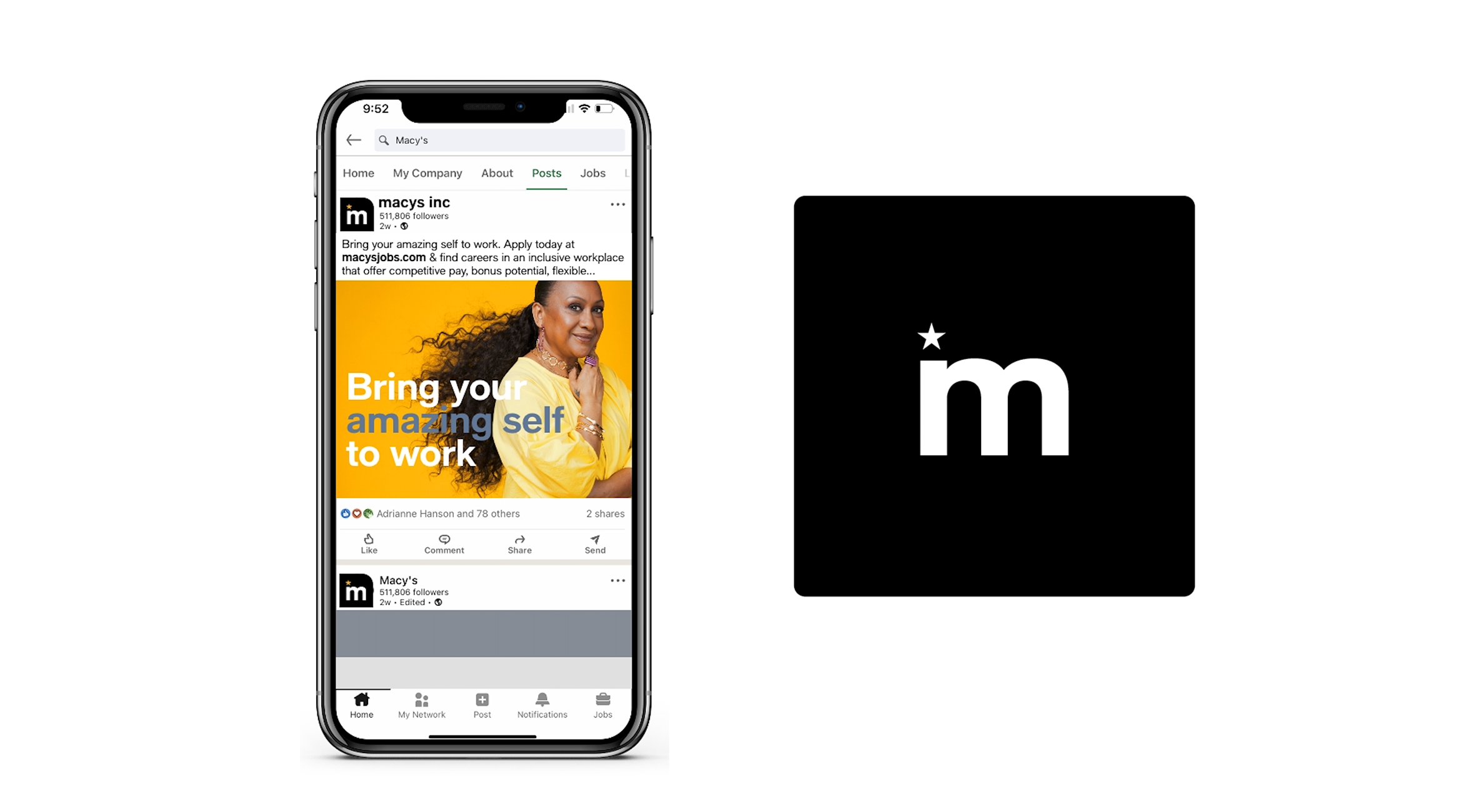
A special monogram was created for the single-letter M stock ticker, replacing the logo in small spaces for digital impact.
The color “Sunshine” was added to the primary palette, representing the commitment to creating brighter futures for colleagues, customers, communities, and business partners. The full palette included a signature color from each of the three retail brands.
A pattern derived from the “m” letterform signified both the flexibility of an individual thread, and its greater strength when united with others.
The signature color bar, supergraphic shapes (also derived from the “m”) and pattern brought modern energy to event swag, the corporate site and email communications.
Department identities were created, including a unique mTech toolkit with key messages in code for recruiting and conference materials.
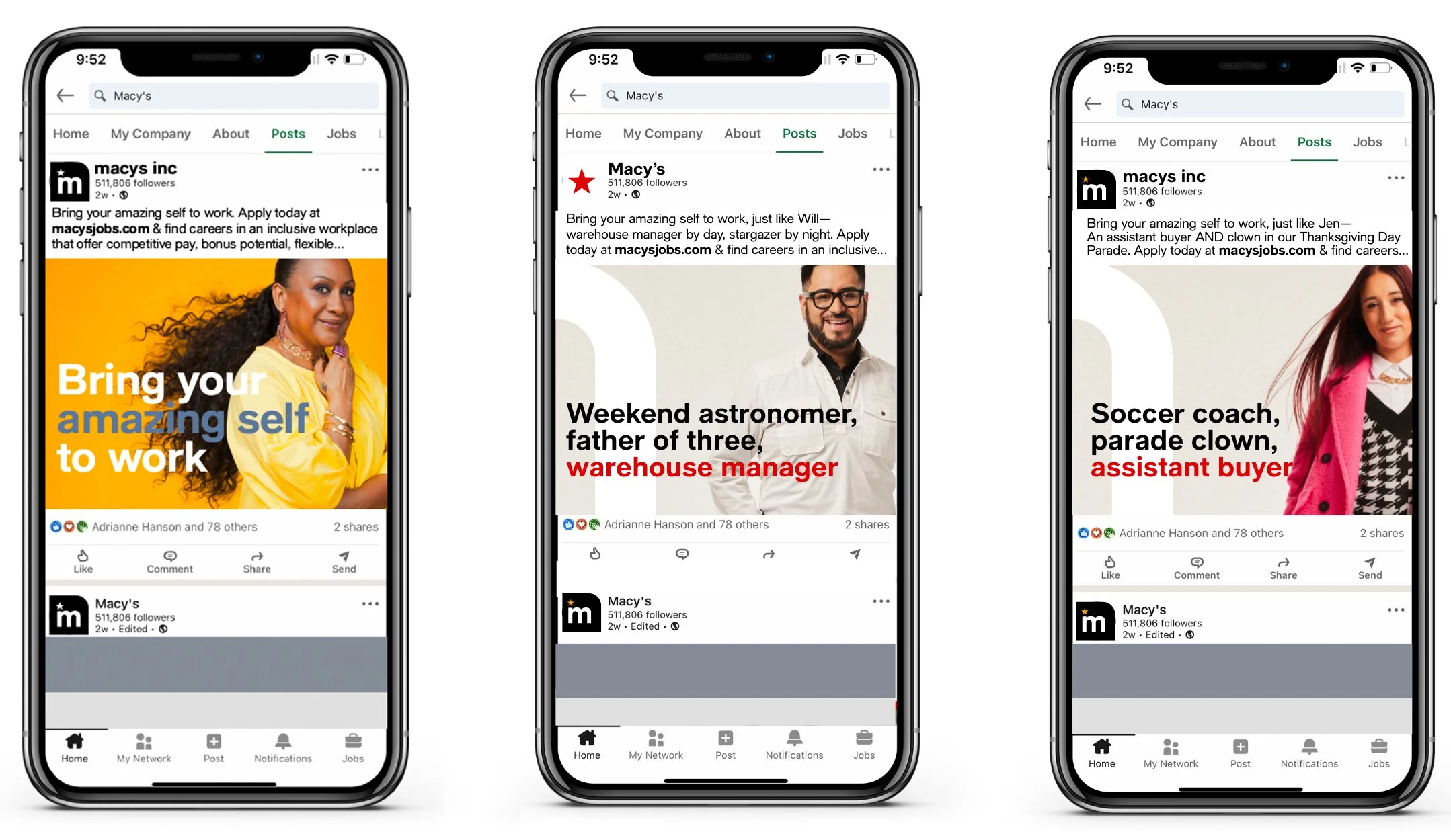
A new recruitment campaign with the tagline “Bring your amazing self to work” celebrated individuality with ads featuring colleagues and the fun personal facts they chose to share.
The impact
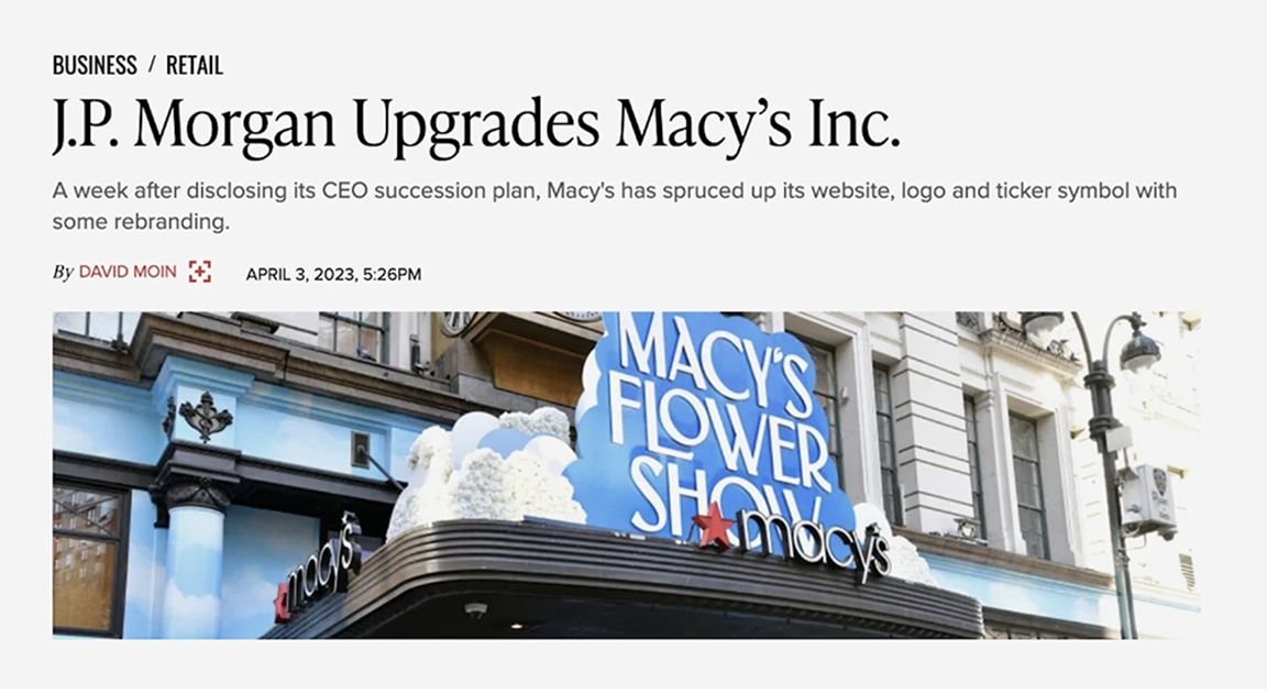
Within five days of the CEO succession announcement, J.P. Morgan upgraded Macy’s stock. We’d like to think the new branding was a factor, but the real measure of success was internal. The work was accomplished in five agile sprints, giving C-suite leaders a firsthand view of our ability to deliver thoughtful work at top speed. More broadly, it boosted colleague confidence in the commitment to broader representation.


